Quiet Elegance: Dusty Blue & Champagne Wedding Inspiration

Dusty blue and champagne is one of those wedding palettes that looks deceptively simple in a single photo but is genuinely difficult to execute well across an entire celebration. The two colors sit close together in tone and saturation, which is exactly what gives the palette its quiet, cohesive feel — and exactly why it can slip into looking flat, washed-out, or generic if the ratios and textures aren't handled deliberately.
This guide goes beyond a basic color description. It covers the specific ratio that keeps this palette from reading as bland, how the undertone of your champagne (warm gold versus cool silver-champagne) changes everything else in your styling, and a practical breakdown of where this combination shines versus where it falls flat. Real invitation and decor examples are included throughout, but the goal here is to help you actually execute the look well — not just admire it.
Disclosure: This post contains affiliate links. If you click through and make a purchase, I may earn a small commission at no extra cost to you. I only recommend products I genuinely love. Thank you for supporting this blog!
Table of Contents
Why This Palette Is Harder to Execute Than It Looks
Most wedding color palette guides treat dusty blue and champagne as an automatically elegant pairing — and in the right hands, it is. But the reason so many real-life versions of this palette end up looking slightly washed out comes down to a simple visual problem: both colors are low-contrast, muted, and close together on the brightness scale.
When two colors are this gentle with each other, the eye has very little to "land on." Without a deliberate plan for contrast, texture, and a clear dominant color, the whole room can start to blur into a single soft gray-beige haze in photographs — especially under venue lighting that isn't ideal.
This isn't a reason to avoid the palette. It's a reason to be more intentional with it than you might be with a higher-contrast combination like navy and gold, where the colors do more of the visual work for you automatically.
The Two Versions of Champagne (And Why It Matters)
Most couples don't realize that "champagne" isn't a single color — it splits into two distinct undertones, and choosing the wrong one for your dusty blue can quietly throw off your entire palette.
Warm champagne leans gold and honey-toned, closer to a pale caramel than a neutral beige. This version pairs beautifully with dusty blue when you want the overall mood to feel cozy and romantic rather than cool or formal. It's the better choice for golden-hour outdoor ceremonies, string lights, and candlelit receptions, since warm light naturally enhances warm champagne tones.
Cool champagne (sometimes called "champagne silver" or "platinum champagne") leans gray and slightly metallic, closer to a pale taupe. This version creates a noticeably more formal, almost icy-elegant effect when paired with dusty blue — think modern ballroom or minimalist editorial styling rather than garden romance.
Why this matters practically: If your invitations use warm champagne foil but your linens are a cool, gray-toned champagne, the mismatch will be subtle in person but will show up clearly in photos, particularly anywhere the two elements appear side by side (like a flat-lay of your stationery suite next to your table setting). Before ordering anything, hold a fabric swatch of your intended linen color next to your invitation paper stock in the same lighting — this single check prevents the most common styling mismatch in this entire palette.
The Ratio That Keeps This Palette From Looking Flat
Because dusty blue and champagne are both muted, low-saturation colors, treating them as a 50/50 split tends to produce the washed-out effect described above. A more reliable approach borrows a ratio more common in interior design than wedding planning:
Roughly 60% champagne or warm neutral, 30% dusty blue, 10% a sharper accent.
The "sharper accent" is the piece most dusty-blue-and-champagne weddings skip entirely — and it's usually the single biggest reason some versions of this palette photograph as elegant while others photograph as forgettable. That accent doesn't need to be a third color; it can simply be a material with more contrast or shine than anything else in the room: a darker wood chair, a deep green leaf tucked into an otherwise pale floral arrangement, or a black-strapped watch on a groom otherwise dressed entirely in soft neutrals.
A simple test before finalizing your styling: Take a photo of your planned tablescape (even a rough mockup) and convert it to grayscale on your phone. If everything blends into roughly the same gray tone with no clear areas of light and dark, the palette needs more contrast before the wedding day — not more dusty blue or more champagne, but something with genuine visual weight.
Best Seasons and Venue Types
This palette is frequently recommended for spring and summer, and there's a real reason beyond aesthetics: both seasons offer abundant, affordable access to the soft white and blush florals (peonies, ranunculus, garden roses) that this palette relies on to avoid feeling sparse. Trying to source those same blooms for a January wedding means paying significantly more for imported flowers or substituting with less ideal options.
That said, the palette's seasonal flexibility depends more on venue type than month:
Glass-walled or naturally bright venues (greenhouses, garden pavilions, light-filled barns) suit this palette in any season because natural daylight makes the subtle tonal differences between dusty blue and champagne visible. In a dim or heavily artificially lit space, the two colors can become difficult to distinguish from each other entirely.
Evening receptions with strong candlelight shift this palette warmer automatically — candlelight pulls out the gold in champagne and can make dusty blue read as more gray than blue. If you love the cooler, more "dusty" quality of the blue specifically, supplement candlelight with some cooler-toned uplighting rather than relying on candles alone.
Outdoor garden and vineyard settings remain the most forgiving venue type for this palette overall, since the surrounding greenery provides the contrast (point 3 above) that the palette needs without any additional styling effort.
Who This Palette Suits — and Who It Doesn't
This palette tends to work best for:
Couples who want their photos to age well rather than feel tied to a specific wedding "year" trend
Outdoor or naturally lit venues where the subtlety of the tones can actually be seen
Couples planning a daytime or golden-hour event, where the lighting does some of the styling work automatically
This palette tends to struggle for:
Large ballroom receptions with heavy overhead lighting and minimal natural light, where the tones can flatten into a single gray-beige wash without significant additional contrast
Couples who want their wedding colors to be immediately, unmistakably identifiable in photos — this is a palette people feel more than consciously notice
Venues with strongly patterned existing decor (heavily patterned carpet, ornate gold wallpaper) that compete visually with the palette's subtlety
If your venue falls into the "struggles" category but you still love this palette, the fix is almost always the same: increase the contrast accent from the 60/30/10 ratio above, and lean harder on warm champagne rather than cool champagne to counteract artificial lighting.
Wedding Stationery Ideas
Wedding stationery is the first glimpse guests get of your wedding style, so it's a great place to showcase this palette — and to decide early which champagne undertone you're committing to for the rest of your styling.
A few specific approaches that work well:
Floral or botanical illustrations in soft champagne tones to complement a dusty blue background
Calligraphy or serif fonts in champagne foil for a classic, elevated look
Dusty blue envelopes lined with champagne-colored paper for a refined finish
Wax seals or ribbon details in dusty blue or champagne to tie the full suite together visually
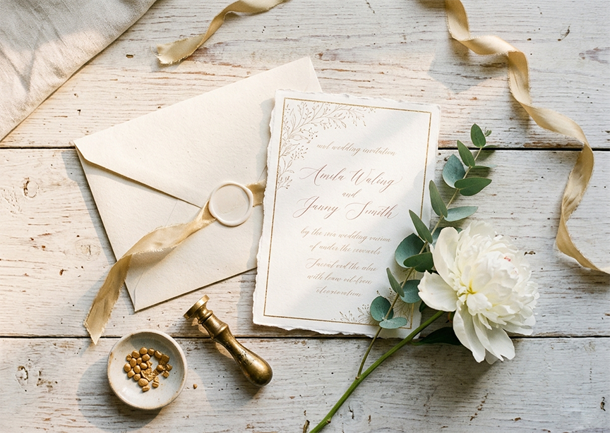
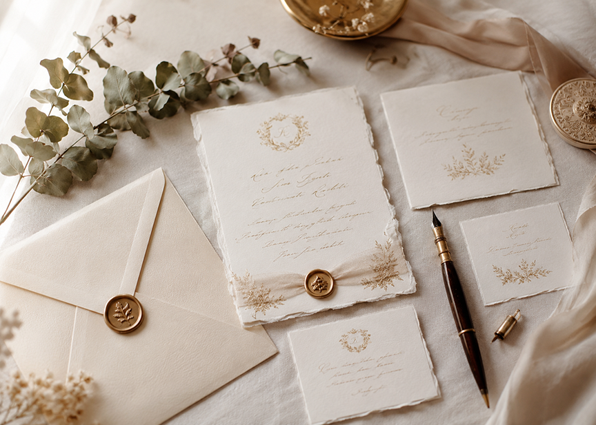
Here are real invitation collections that capture this palette well:


Matching your stationery to your champagne undertone: Designs with warm botanical illustrations and script typography generally use a warmer champagne tone, while the crest and monogram-style designs tend to photograph in a cooler, more formal champagne. Ordering a physical sample of your top choice before finalizing your full suite lets you check this against your actual linen and floral swatches.
Decoration Ideas
Decorations are where the 60/30/10 ratio from earlier in this guide matters most, since this is typically where couples have the most square footage to fill with color.
Use dusty blue linens for tablecloths or runners (the 30%), paired with champagne-colored napkins or chair sashes (part of the 60%)
Incorporate champagne-colored candles in glass holders — these straddle the line between decor and lighting and do double duty for both
Choose floral arrangements with white, cream, and blush flowers accented by dusty blue thistle or hydrangea, rather than all-blue arrangements, which can look heavier and less elegant than expected
Add gold or rose gold accents (the 10% sharper contrast) in vases, picture frames, or table numbers
Use draped fabric in dusty blue and champagne for ceremony arches or photo backdrops, but anchor it with greenery so the fabric doesn't read as flat against itself
Styling tip: If your venue has warm wood floors or furniture, lean toward warm champagne in your decor to stay cohesive with the existing space rather than fighting it with a cooler, more silver-toned champagne.


Favors for Guests
Favors are a small detail, but they're also one of the few touchpoints where guests physically take a piece of your color palette home with them — worth a bit of extra thought beyond simply matching the colors.
Mini champagne bottles with dusty blue personalized labels
Scented candles in dusty blue jars with champagne-colored lids
Custom cookies decorated with dusty blue and champagne icing
Seed packets in dusty blue and champagne packaging, for guests to plant later
Elegant soap bars wrapped in dusty blue paper, tied with champagne ribbon


A practical favor note: Hand fans double as both a favor and a functional item for outdoor summer ceremonies, making them one of the more practical favor choices on this list for warm-weather weddings specifically.
Sweets and Drinks Ideas
Serve a champagne toast with flutes decorated in dusty blue ribbon or charms
Offer blueberry or lavender macarons in dusty blue shades, alongside champagne-colored vanilla or caramel treats
Create a wedding cake with dusty blue fondant and champagne-colored edible accents, such as gold leaf or sugar flowers
Include a signature cocktail with a pale blue hue (a Blue Lagoon, or a cocktail using blue curaçao), garnished with edible gold flakes for a champagne-toned accent
Provide champagne sorbet or champagne-infused desserts for a more unexpected take on the flavor pairing
Flavor-pairing note: Because dusty blue doesn't correspond to a common food flavor the way, say, chocolate brown does to coffee, most of the "blue" element in food and drinks comes from blueberry, lavender, or blue curaçao rather than the food matching the exact dusty blue paint-chip tone. This is completely normal — the goal is color-story cohesion across the table, not literal hue-matching on every dessert.
FAQ: Dusty Blue and Champagne Wedding Palette
Why does my dusty blue and champagne wedding decor sometimes look washed out in photos? This usually happens when both colors are too close in saturation and brightness without enough contrast elsewhere in the space. Adding one element with genuine visual weight — a darker wood accent, deeper greenery, or a black detail — fixes this more effectively than adjusting the blue or champagne tones themselves.
Should I choose warm or cool champagne for my wedding? It depends on your venue and lighting. Warm champagne (gold-toned) suits candlelit, golden-hour, or garden settings, while cool champagne (silver-toned) suits modern ballrooms or minimalist, editorial-style weddings. Check your invitation paper stock against your linen swatch in real lighting before finalizing either.
What ratio of dusty blue to champagne looks best? A roughly 60% champagne or neutral, 30% dusty blue, 10% sharper contrast accent tends to photograph better than an even split, since both base colors are muted and need a clear dominant tone plus one higher-contrast detail to avoid looking flat.
Is this palette better for outdoor or indoor weddings? Outdoor and naturally lit venues generally suit this palette best, since daylight makes the subtle tonal difference between dusty blue and champagne genuinely visible. Indoor venues with heavy overhead lighting need more deliberate contrast to avoid the colors blending together.
What time of year works best for a dusty blue and champagne wedding? Spring and summer are popular largely because the soft white and blush florals this palette relies on are most affordable and widely available during those seasons. The palette itself can work in any season with the right venue and lighting.
What if my venue has a lot of existing patterns or strong colors, like patterned carpet or gold wallpaper? This palette tends to struggle against strongly patterned existing decor, since its subtlety gets visually lost. If your venue has this kind of strong existing pattern, leaning harder into the warm champagne tone and adding more contrast accents (per the ratio above) helps the palette hold its own.

Comments